
TINYTALES
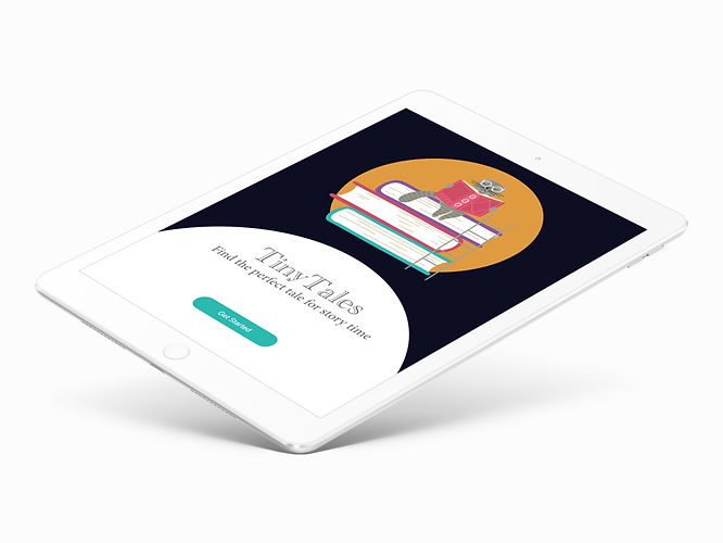
An iPad/Tablet app that makes it easy for parents to find great stories that are a good fit for their children
The Solution
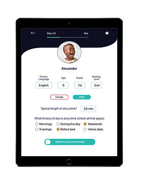
TinyTales uses a simple interface with clear cut navigation and incorporates a 3-step child profile that allows you to customize search results specifically for your child or for multiple children. TinyTales browsing function also hosts a visual menu of recommended stories and allows the user the ability to save, ditch, favorite or share stories.

Project Lead
UX/UI Designer
My Role
The Problem
TinyTales is an iPad/tablet app containing a library of children’s stories and illustrated books. Parents use the app to read to their young children ages four to nine. Because there is a large library of stories, parents find it difficult and time consuming to find ones that fit their families needs. TinyTales wants to incorporate a way to make it easier for parents to find great stories
that are a good fit for their children.

Sector
Education, Reading
Personalization
Tools
Adobe XD
Adobe Photoshop
Miro, POP by Mural
The Process
The TinyTales design concept was developed using a modified Google Venture design sprint over the course of 5 days with the development being paced as follows:
-
Day 1: Read through the challenge brief/supporting documentation then map a possible end-to-end experience the user might have with the app
-
Day 2: Complete a solo version of lightning demos looking at competitor solutions then sketch out own solution sketch
-
Day 3: Create a storyboard to serve as a guide
-
Day 4: Create an interactive prototype
-
Day 5: Conduct evaluative research with a round of usability testing
Before learning more about my users needs, motivations and experiences, I defined the following project goals:


Create an easy efficient, and engaging platform for parents seeking stories that are a good fit for their children
Create a platform where parents can input their desired specifications for story time
Create a sophisticated, yet kid-friendly visual design
Create a seamless user experience
Design Challenge
How might we provide parents with a way to quickly and easily find the right story for their children?
Day 1 : Understand/Map
To better understand the problem, I read through the challenge brief and supporting documentation making notes. My goal was to gain insights into the users
specific wants and needs. Here is what I learned:

Authors and illustrators can publish children’s stories on the app

Parents do not order hard copies of the books, they read all
the stories and books directly in the app

Children like to
browse and help choose the story and/or book

Stories/books
need to be the
right age level
(not too easy
or hard)

Children like to
hear stories
about topics that
currently interest
them

Parents need to
know how long
the story/book
takes to read

Parents want to
quickly be able
to find new stories
their children will
like as much as
their favorites

Parents would like
to be able to trade recommendations with friends and family

Parents want to minimize their
search (easy
and fast)

Parents want to
be able to choose stories that are educational and have a lesson

Parents like to
read reviews
given by other parents

Parents want to be
able to choose a
book that appeals
to all their children regardless of
age gap

Parents want to be
able to find stories
that are relevant
to experiences
their child is
going through

Parents value
story time

Parents want to
instill a love of reading in their children

Parents want
their children
to learn and
ask questions
Map
After reading through and synthesizing the information from the challenge brief and supporting documentation, I mapped a possible end-to-end experience the user might have with the app.

This experience takes the user through:
-
Logging in or creating an account
-
Completing a profile (or as many as needed; 1 per child)
-
Seeing/browsing suggested stories
-
Viewing specific story information
-
Reading the story
-
Rating and reviewing the story
Day 2 : Lightning Demos /Sketch
Using a modified lightning demo, I looked at competitor products that solve a similar problem to seek inspiration and to see what features could be improved and/or modified. Here is what I found:

Crazy 8's Sketching Exercise:
Which map screen is the most critical for the user?
The most critical screen is where the user creates the child’s profile and completes the user survey. This information will narrow the time spent searching each night and will allow for custom recommendations.
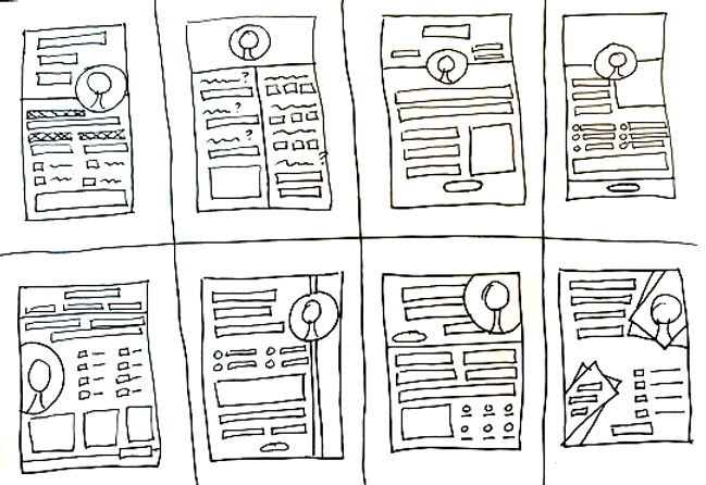
Focusing on this screen, I sketched eight unique ideas in eight minutes. The purpose was to challenge myself to push beyond my first idea:

Solution Sketch:
From my crazy 8’s screen sketches I chose the best screen and created a solution sketch. The solution sketch is a three panel sketch that includes: 1) the screen that comes before the best critical screen, 2) the best critical screen, 3) the screen that comes after the best critical screen.

Day 3 : Decide/Create

Next I created a nine panel storyboard that included my solution sketch plus six new screens that focused on the interactions that the user will need to have to complete the desired tasks in the app.


The storyboard does show the direct actions needed to get from launching to goal but does not contain all of the actions a user could complete through each screen. More details were fleshed out in the next iteration.

Day 4 : Prototype
I wanted the app to be sophisticated enough for adults but still simple and kid-friendly. To achieve this I used a lot of white space, bright colors and clear, easy to understand navigation. For this app I chose a minimalist neutral background that housed bright pops of color. The colors I chose to go with are a deep dark midnight blue, crisp white, slate gray, mouse gray, strawberry pink, goldenrod yellow, ocean blue and deep mulberry:

Because I was designing for the iPhone I utilized the standard system font for IOS, San Francisco Pro. For the icons and UI Elements I used the Outfitr kit. The color scheme and repetitive UI elements brought consistency across the screens. The images were created with the use of free clip art that I combined using layers and then colored in Photoshop.

High Fidelity Mockup
To create my high fidelity mockups I used a UI kit base and my sketches as a guide. Working in Adobe XD I begin designing screen by screen rearranging, modifying and creating elements as needed.


As I designed each screen I paid close attention to alignment, balance and visual hierarchy of the elements. To create the final look I focused on white space/negative space. Keeping this as a main focus resulted in a clean, minimalistic design.


Placement of color was key in not only creating a visually appealing design but also in pointing the user toward the next step or call to action. Space distribution was also vital in functionality. Buttons are separated from visuals. Menus are separated from descriptions.


By placing each element in their own space the user is easily able to visually categorize the information, therefore increasing discoverability and reducing confusion. The goal of making it easy and simple for parents to find the right story for story time was the ultimate filter used to make design decisions.


The design of the read book screens:

Once the design was completed I was ready to test the prototype. My goals for the usability testing was to see how easy and clear navigation is for the user, to find out if the design is visually appealing, to see if there is any confusion when using the app and to make sure the app accomplishes the goal and brings value to the user.
Day 5 : Validate/Test

Introduction
The usability test was conducted remotely over Zoom. The goal was to test the design of the app to see if it is user-friendly and functions as intended. During the session participants were asked to complete a series of tasks using the app prototype on the screen. I gave them the tasks to complete and then observed them as they tried to complete each task. Participants were asked to please try to “think out loud” as much as possible so I can capture their thoughts. These participants were recruited because they all are parents or family members who read/have read to children ages four to nine.
Main Tasks:
As a parent:
Navigate how to
create an account
and/or sign in
As a parent:
create a profile for your child(ren)
As a parent:
understand how to browse suggested stories and find the information you need (rating, length, themes, etc)
As a parent:
understand
how to start and navigate through the story
As a parent:
understand how to rate, review and share the story
As a parent:
choose which children are receiving story
time
This usability testing experience went very smoothly. For the most part participants liked the design of the app and knew how to navigate through it. The comments in general were very positive overall. Some slight issues with wording, buttons and add on features were noted. The most glowing user quote was:

“I really love all of it. The design is stellar and I can tell a lot of thought was put into the user experience. If the idea is a good story time experience for a child then I think the functionality is on par.”
- Stepmother of 9-year-old and aunt of 5 & 7 year old
Redesign
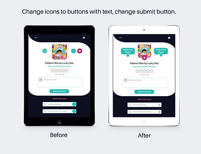
Using the findings/usability issues noted during the usability testing I redesigned the following screens:


TITLE OF THE CALLOUT BLOCK
Conclusion & Reflection

Using the modified GV design sprint process really pushed me to use faster processes, allowed me to not sweat every little design decision and opened up my mind to the concept of being quick but still creative. Designing an app that 5 out of 5 testers said they would utilize was very rewarding. The design process builds as you move through the design process with each step giving you insights into the needs and wants of the users.
The goal of providing a way for parents and/or family members to quickly and easily find the right story for their children was achieved. Users found the app to be easy to navigate with clear cut steps. They enjoyed the visual design and that they only had to set up the profile once to get customized suggestions.
I was very proactive with this design, allowing the information gleaned from the challenge brief and supporting documentation to guide me. Combining that information with good design principles resulted in a positive, engaging experience for TinyTales users.

Try the interactive prototype:
https://xd.adobe.com/view/eb3c75cb-db8e-45ed-9652-6e99fdbbac32-be6f/